Tuesday, February 15, 2011

Photographic Composition

1. Point Of Interest
Identify a primary point of interest before taking the picture. When you've determined which area is the most important to you, you can compose to emphasize it. composition.


2. Simplicity
Be sure that only the things you want the viewer to see appear in the picture. If there are numerous objects cluttering up the background, your message will be lost. If you can't find an angle or framing to isolate your subject, consider using depth of field control to keep the background out of focus


3. Contrast
A light subject will have more impact if placed against a dark background and vice versa. Contrasting colors may be used for emphasis, but can become distracting if not considered carefully


4. Balance
Generally, asymmetric or informal balance is considered more pleasing in a photograph than symmetric (formal) balance. In other words, placing the main subject off-center and balancing the "weight" with other objects (smaller or lower impact) will be more effective than placing the subject in the center

5. Framing
A "frame" in a photograph is something in the foreground that leads you into the picture or gives you a sense of where the viewer is. For example, a branch and some leaves framing a shot of rolling hills and a valley, or the edge of an imposing rock face leading into a shot of a canyon. Framing can usually improve a picture. The "frame" doesn't need to be sharply focused. In fact if it is too sharply detailed, it could be a distraction

6. Viewpoint 
You can often change a picture dramatically by moving the camera up or down or, stepping to one side. One of the best ways to come up with a prize-winning photograph is to find an "unusual" point of view
7. Diagonals
Linear elements such as roads, waterways, and fences placed diagonally are generally perceived as more dynamic than horizontals

8. Rule of Thirds
Last, but not least, is something called the "rule of thirds." This is a principle taught in graphic design and photography and is based on the theory that the eye goes naturally to a point about two-thirds up the page. Also, by visually dividing the image into thirds (either vertically or horizontally) you achieve the informal or asymmetric balance mentioned above


Friday, February 11, 2011

TEN TIPS FOR SHOOTING STUDIO PORTRAITS

1. Think of shooting in a studio like a bowling ally

With your model in place, and you directly in front of them, you can only move forward and back.  You cannot move to the left or right, and depending how wide your lighting is, neither can the model.  Rather then take two steps to the left, you will have to ask the model to turn.

2. Watch the clock
Your height, combined with the distance between you and the model, and their height will ensure you are at the proper height.  Because most all portraits look best when shot at the eye-level of your model, you’ll need to compensate.  Sometimes this will mean bending down a little or even getting on one knee, other times you may need a step-stool or ladder to boost your height a little.  The wrong perspective can really ruin a portrait.

6. 1/125 and forget it

Studio shooting camera settings are pretty simple and straight forward.  Set your camera to manual mode, set the ISO to 100 (or 200 if you don’t have 100) and the shutter speed to 1/125.  Because of the strobes, there will be virtually no difference shooting at 1/100, 1/125, 1/160 or even 1/200th of a second.

7. Use a light meter

In camera metering is great, but it doesn’t account for multi-light setups, nor can it help you nail your exposure on the first shot, or properly expose hair lights or background lights with a breeze.  Just because you know how to read a histogram doesn’t mean you shouldn’t use a light meter, it will take the headaches out of lighting.

8. Focus on the eyes


Regardless the aperture you choose, for shallow depth of field or not, the eyes are what really tell the story of a portrait.  Your focus should always be on the eyes, where they are looking and ensuring they are in focus.

9. Do a custom white balance.

We know, custom white balance is brought up here time and time again, but for good reason!  Studio light modifiers, like umbrellas, softboxes and snoots all have an effect on the color output of the strobes, so doing a custom white balance before each shot ensures the most accurate possible color representation.

10. Try just one light

Famed fashion photographer Helmut Newton was famous for using only a single light.  Doing so, and changing the angle in relation to the model can create dramatic shadows and stunning photos.  Just because you have access to a handful of strobes doesn’t mean you always need to use them.  Try some more simple approaches to lighting and modifying that single light, instead of using every tool in your toolbox. Studio portraits can be some of the most complex shoots to setup, but also some of the most rewarding.  Hopefully these ten tips will help and inspire your photography and continue on the path of knowledge


Not for time, but for direction to your model.  It’s very easy to confuse and get confused if you ask them to turn right or left, but turning clockwise or counter-clockwise is the same for you and the model
3. Who’s right?
While clockwise and counter-clockwise will help to an extent, sometimes you need the model to move right or left, and for this, you’ll need to know who’s right.  It’s best if you can train your mind to ask them to move to their right, so they don’t have to think about where to go.  This is very important when dealing with models who don’t do it professionally, like high school seniors

4. Go prime
There is and always will be arguments for zoom lenses in the studio, but if you can, stick with primes.  They tend to be sharper and it’s one less setting you have to do.  The standard lens most portrait shooters use will fall somewhere between about 80mm and 200 mm.  If you shoot a cropped sensor camera, don’t forget to include this into your choice of lens.  Canon full-frame shooters tend to prefer lenses like the 85mm f/1.2 and 135mm f/2, while cropped sensor shooters tend to prefer the 50mm f/1.2 and f/1.4 lenses.  Nikon shooters as well lean towards the 85mm f/1.4 lens.

5. Be at the right height

ASSIGNMENT 3

Book Cover


Penggunaan Warna
Warna memainkan peranan yang sangat penting dalam menghasilkan kulit buku
Penggunaan warna yang tidak sesuai akan mengakibatkan kulit buku menjadi kurang menarik
Penggunaan warna yang terang akan menarik pembaca untuk melihat lebih terperinci isi kandungannya
Kulit buku ini menggunakan warna biru lembut, kuning lembut sebagai latar belakang. Warna yang terang akan menarik minat individu untuk melihat isi kandungannya
Penggunaan grafik gambar kanak-kanak yang ceria menunjukkan keadaan yang sihat dari segi pernafasan dan sistem tubuh badan. Penggunaan grafik pokok sebagai penyumbang utama pada oksigen untuk tubuh badan kita. Grafik jantung digunakan sebagai penerangan kepada isi kandungan buku tersebut. Secara logiknya apabila pembaca melihat kulit buku ini maka sudah dapat disimpulkan isi kandungan buku tersebut.

Tulisan pula berwarna putih dan bergarisan merah supaya lebih jelas. Ini secara tidak langsung dapat menghaslkan contrast warna dengan latar belakang supaya tulisan akan nampak timbul atau subjek utama..
Tulisan
Tulisn jenis bersaiz besar  digunakan supaya kelihatan jelas dan disasarkan kepada semua golongan pembaca dan diutamakan untuk orang dewasa.
Grafik
Menggunakan kanak-kanak, pokok diagram jantung supaya dapat menerangkan serba sedikit kepada pembaca mengenai isi kandungan buku itu. Apabila pembaca melihat kulit buku tersebut maka sudah tentu pembaca tahu isinya berkaitan sistem pernafasan manusia.
Antara perkara yang perlu diberi perhatian sebelum membuat design kulit buku adalah seperti berikut:

1.      Buku itu buku apa?
2.      Apa isi utama buku itu?
3.      Siapakah sasaran pembeli buku itu?
4.      Siapakah sasaran pembaca buku itu?
5.      Jantina lelaki atau perempuan.
6.      Bagaimana buku itu akan dipasarkan?
7.      Berapa tebal buku itu?
8.      Berapa saiznya?
9.      Bila buku itu mesti dihantar ke percetakan?

Ciri-ciri mencipta design kulit buku

1.   Kulit itu mesti dapat menjual buku itu. Banyak buku yang baik isinya tidak laku dijual kerana kulit buku itu tersalah konsep. Penerbit terus menyuruh artis mencipta design kulit buku tanpa memberikan taklimat tentang latar belakang yang penting berkenaan bagaimana buku itu akan dipasarkan.
2.   Fungsi design kulit buku adalah MENJUAL buku itu, bukan menerangkan isi buku.

Monday, February 7, 2011

ASSIGNMENT 2 - Image Manipulation Using Adobe Photoshop CS

1. Imej Photo Booth

Buat dokumen baru dengan ukuran 5 inci lebar 30 inci tinggi resolution 72.


Buka imej iaitu pic 1, pic 2, pic 3, pic 4, pic 5 dan pic 6


Pilih pic 1 klik pada ikon crop di tool bar kemudian saizkan kepada 5 inci lebar 5 inci tinggi dan resolution 72


Selepas itu crop pic 1> move ke Background layer , pic 2, pic 3, pic 4 dan pic 5 arahan yang sama seperti pic 1


Berikan border pada setiap gambar agar kelihatan menarik


Pergi pada layer 1 klik kanan klik pada blending Option > Stroke> pilih warna yang sesuai > saiz 10 > position inside > ok


Selepas itu pergi pada layer 1 klik kanan klik pada copy layer style > pastekan layer style pada setiap layer supaya semua gambar tadi ada border yang sama saiz. Gabung kesemua gambar tersebut dengan tekan ctrl > E


Buat dokumen baru dengan saiz tinggi 20 inci lebar 15 inci resolution 72


Drag gambar tadi ke layer yang baru dibuat. Letakkan ditengah-tengah (center)


Klik pada Filter > Distort > Shear. Selepas itu gerakkan point ikut kehendak masing-masing


Klik pada Edit > transform > rotate


Untuk menampakkan lebih realistic kita letakkan bayangan. Add layer baru klik pada brush saiz 300 warna hitam > drag dari atas sampai bawah kemudian adjustkan opacity ke 50%.


Add layer baru atas layer tadi klik pada brush saiz 300 warna putih tarik atas garisan antara gambar. Tukarkan opacity kepada 75%. Pergi pada layer 3 tadi drag layer 3 ke atas layer 2 dengan menekan alt supaya warna putih dapat sepadan.


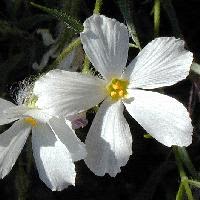
Kemudian savekan jadikan file jpeg. Contoh gambar dibawah.


2. Imej Pensetaraan Saiz dan Pencahayaan

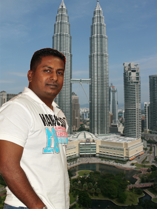
Menggabungkan pelbagai imej yang mempunyai kesetaraan warna, pencahayaan dan sebagainya untuk membentuk satu imej baru yang lebih realistik. Contoh latar belakang sesuatu imej digantikan dengan latar belakang dari imej yang lain.


Sediakan 2 imej yang dirasakan sesuai untuk digabungkanbagi membentuk imej yang baru.


Pic 1

Pic 2
Buka Adobe Photoshop CS

Buka fail pic 1 dan pic 2 menggunakan arahan File > Open

Aktifkan imej pic 1 dengan mengklik pada skrin pic tersebut

Gunakan ikon Polygonal Lasso di Toolbox buat pilihan kawasan yang dikehendaki.

Selepas imej yang dikehendaki telah dipilih gunakan arahan Edit > Copy.

Aktifkan file pic 2 dan ditampalkan di situ gunakan arahan Edit > Paste

Imej dari pic 1 telah ditampal di pic 2.

Gunakan ikon Move untuk gerakan imej tadi dah diletakkan ditempat yang sesuai.

Jika ubahsuai saiznya gunakan arahan Edit > Transform >Scale mengikut kesesuaian

Jika terdapat perbezaan dari segi warna di antara 2 gambar tersebut gunakan arahan
Image>Adjust>Brightness/Contrast untuk menampakknya lebih realistic

Savekan jpeg. Contoh gambar di bawah.


3. Imej Cat Air
Sediakan Open 2 gambar iaitu Pic 1 dan Pic 2


Open new file  > saiz 800 x 600 resolution 72
Klik Pic 1 > move ke  Layer 1
Klik Pic 2 > move ke Layer 1
Letakan layer pic 2 sebelah atas Layer pic 3


Cantumkan Layer 2 dan 3 dengan tekan ctrl+E
Klik pada Filter >Brush Stroke > Crosshatch > masukkan nilai 7 pada Stroke Length dan Sharpness 7 > ok
Kali kedua Klik pada Filter >Brush Stroke > Crosshatch > masukkan nilai 7 pada Stroke Length dan Sharpness 7 > ok
Selepas itu klik pada Filter > Texture > Texturizer ambil scaling 76% dan Releif 7 > ok
Maka jadikan lukisan tersebut seperti Lukisan Cat Air
Savekan dalan format jpeg.

4. Imej Bayangan

Open File Pic 1

Open new file > 600 X 800 > move kan Pic 1 ke Layer yang baru
Buat dalam bentuk Frame
Adjust kedudukan supaya nampak lebih realistic dengan mencondongkannya
Copy layer baru > kemudian adjustkan kedudukan seperti ini gunakan Transform


Sekarang letakkan Filter > Effect > Blur > Glausian Blur > Radius 2.7> ok ada Layer Copy 2
Selepas itu tambahkan dengan Filter > Render > Lens Flare > ok
Masukkan background dengan warna hitam
Dah siap savekan dalam bentuk format jpeg.

5. Imej Kartun

Open file Baru 800 x 600 Resolution 72
Open semua File Pic yang hendak digabungkan
 
Pada Layer yang baru di buat drag kan semua gambar tadi.
Susun ikut citarasa. Yang pastinya kenalah menarik

Gabungkan semua layer Ctrl + E
Sekarang  pergi pada Filter > Artistic > Poster Edges
Kemudian Brightness & Contrast  >  values: Brightness Value: 10 Contrast: 30

Untuk dapatkan hasil kartun pergi Filter > Artistic > Cut Out
Dah siap savekan jpeg


6. Imej Clone Stamp Tools

Imej Tampalan Guna Clone Stamp Tools
Open New  Canvas saiz 800 X 600 resolution 72
Open 11 keping gambar yang dirasakan sesuai untuk ditampal


Selepas itu pilih satu gambar terlebih dahulu klik Clone Stamp Tools > Alt klik pada bahagian yang hendak diklon.
Selepas itu klik semula pada canvas yang kosong supaya gambar yang diklon tadi akan ditampal di situ
Buat ke atas semua gambar yang hendak diklon. Amat mudah dan cepat
Kemudian savekan dalam file jpeg